>TenhGrey No edit summary |
>IggyAndPkmn No edit summary |
||
| Line 24: | Line 24: | ||
If you have any input, feel free to give me your POV. [[User:TenhGrey|// TenhGrey]] 15:22, June 9, 2012 (UTC) | If you have any input, feel free to give me your POV. [[User:TenhGrey|// TenhGrey]] 15:22, June 9, 2012 (UTC) | ||
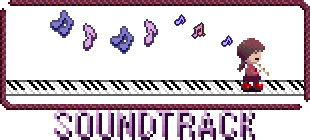
*Hm, I'm liking that second soundtrack titlecard, the one with Madotsuki on the piano. And yeah, I think you're right about the titlecard that's being used now for Fan Art being a little heavy-looking, but there's something about that alternative Fan Art titlecard that seems to sort of...stick out. It doesn't quite look as 'dark' as the rest of the titlecards, which is why I think it won't really fit in. [[User:IggyAndPkmn|IggyAndPkmn]] 19:26, June 10, 2012 (UTC) | *Hm, I'm liking that second soundtrack titlecard, the one with Madotsuki on the piano. And yeah, I think you're right about the titlecard that's being used now for Fan Art being a little heavy-looking, but there's something about that alternative Fan Art titlecard that seems to sort of...stick out. It doesn't quite look as 'dark' as the rest of the titlecards, which is why I think it won't really fit in. [[User:IggyAndPkmn|IggyAndPkmn]] 19:26, June 10, 2012 (UTC) | ||
** You know, that was my preferred soundtrack image too. I think it's a little more aesthetic. Why don't we try it on?<br/> As for the Fan art one, you're guess is as good as mine. I'm stumped. What did you mean by 'dark', though? You mean the contrast is literally too high, or was it that the image isn't as gloomy in style? [[User:TenhGrey|// TenhGrey]] 11:39, June 11, 2012 (UTC) | ** You know, that was my preferred soundtrack image too. I think it's a little more aesthetic. Why don't we try it on?<br />As for the Fan art one, you're guess is as good as mine. I'm stumped. What did you mean by 'dark', though? You mean the contrast is literally too high, or was it that the image isn't as gloomy in style? [[User:TenhGrey|// TenhGrey]] 11:39, June 11, 2012 (UTC) | ||
** Yeah, I like the new soundtrack titlecard...but about the Fan Art one, I meant 'dark' in sort of both ways. The colors are a bit brighter than the others, and it looks a little...er, happier/cuter than the rest of them (I mean, just compare it to the theories and characters titlecard, haha.) [[User:IggyAndPkmn|IggyAndPkmn]] 20:17, June 12, 2012 (UTC) | |||
Revision as of 20:17, 12 June 2012
Hey, guys, as we all know, the names of all great wikis are portmanteaus (even the great Wikipedia), what do you think of changing the name of this one to Yume Wikki? It has a nicer ring to it than Yume Nikki Wiki. 75.90.80.51 04:33, July 7, 2010 (UTC)
- Or at least Yume Wiki. I'm for the change. TwosComplement 18:30, July 13, 2010 (UTC)
- On the other hand, people searching for a Wiki like this on Google are more likely to search for "yume nikki wiki" than "yume wikki", so we get more traffic with this name. There is, in fact, already a wikia called Yume Wiki which nobody knows about for this very reason. IMO, we should keep the name as it is. //TenhGrey 02:12, June 6, 2011 (UTC)
New Theme Colors
Hey, everyone! I've gone and given our dear wiki a new colour scheme, based around uboachan's scheme. I think anything would look better than the default colours, but I don't know if grey is really everyone's cup of tea. Ideally, I'd like to give the page a background graphic, maybe something like a montage of all the popular characters and scenes from the game?
So tell me if you like the new look, or any changes you want to make. I want to hear your opinion, so please speak up!
//TenhGrey 02:15, June 14, 2011 (UTC)
looks good to me. kinda reminds me of Uboa. Hell, anything's better than the original scheme.Playon997 Live in the stars. Live in the fu7ure. 04:50, July 17, 2011 (UTC)
Alternate Titlecards
You probably noticed that I improved the titlecard files to use the in-game font and spaced out the borders a little like they are in game. That big blue Arial text looked a bit tacky for my tastes.
Anyway, there are a couple alternate versions of the titlecards I made for the soundtrack and fan art pages.


Obviously, choosing an image of Fan Art to represent all Yume Nikki Fan Art is a tall order, so I went with the image you get if you play Madotsuki on Akinator. However, that image has a background, wheras the alternate titlecard looks a little less 'heavy' on the front page, so I don't know which one is really better.
If you have any input, feel free to give me your POV. // TenhGrey 15:22, June 9, 2012 (UTC)
- Hm, I'm liking that second soundtrack titlecard, the one with Madotsuki on the piano. And yeah, I think you're right about the titlecard that's being used now for Fan Art being a little heavy-looking, but there's something about that alternative Fan Art titlecard that seems to sort of...stick out. It doesn't quite look as 'dark' as the rest of the titlecards, which is why I think it won't really fit in. IggyAndPkmn 19:26, June 10, 2012 (UTC)
- You know, that was my preferred soundtrack image too. I think it's a little more aesthetic. Why don't we try it on?
As for the Fan art one, you're guess is as good as mine. I'm stumped. What did you mean by 'dark', though? You mean the contrast is literally too high, or was it that the image isn't as gloomy in style? // TenhGrey 11:39, June 11, 2012 (UTC) - Yeah, I like the new soundtrack titlecard...but about the Fan Art one, I meant 'dark' in sort of both ways. The colors are a bit brighter than the others, and it looks a little...er, happier/cuter than the rest of them (I mean, just compare it to the theories and characters titlecard, haha.) IggyAndPkmn 20:17, June 12, 2012 (UTC)
- You know, that was my preferred soundtrack image too. I think it's a little more aesthetic. Why don't we try it on?
